Thursday, 11 February 2016

Final Studio Practice Portfolio influences

Potential inspirations

Ellen O'Connell
Detail10 copy.jpg Detail1 copy.jpg Detail7 copy.jpg Detail4 copy.jpg
Detail2 copy.jpg Detail12 copy.jpeg Detail6 copy.jpg Detail5 copy.jpgfragment4.jpg  Temple3 copy.jpg Temple2 copy.jpg goodbyeuma8 copy.jpg GoodbyeUma3.jpg fragment8.jpg
fragment7.jpg fragments12.jpg Figure7 copy.JPG Figure4 copy.jpg  Renderings6 copy.jpg Renderings9 copy.jpg Renderings10 copy.jpg

Ellen O'Connell is a photographer who was born in Pennsylvania. She is most well known for her work with fine art photography. The work from her I like particularly was a project called detail which is the first 8 photos you can see above, I liked it because even though the view was very up close there was a lot going on in the photo and there is a lot of information for the viewer to take in. this is one of the pieces of work I got inspired by and decided to do my own variation of.

Ellen O'Connell - Inspiration
Detail10 copy.jpg Detail1 copy.jpg Detail7 copy.jpg Detail4 copy.jpg
Detail2 copy.jpg Detail12 copy.jpeg Detail6 copy.jpg Detail5 copy.jpg 

My Attempts


When first trying to create photos in the style of Ellen O'Connell I wanted to photograph a similar item to grapes, I chose a chain because like grapes there are many of the same shapes being repeated, at first I tried it with just the chain in different positions, while this looked good and showed off a lot of detail like the original Ellen O'Connell photos I found that it was very dull and boring to view, to change this I decided to just simply add a filter but felt that it took the artistic and serious view away from it.


After deciding that the coloured filter wasn’t very effective I decided change the settings to black and white but I also decided to add something to the chain, I decided to add something that was natural to link back to the original idea but also to create a contrast between the man made object which was the chain and a natural object which was the leaves.


After I added the natural things to the chain I decided that I wanted it to stand out more and create more contrast, to do this I decided to take my settings off of black and white which I thought was very effective, not just because I wanted the leaves to contrast the chain but also because it showed off the light more and how it bounced off the chain and created shadows with the leaves.


Once I was sure and happy with what I was doing I decided to change the set up and layout of the chains and leaves, I also decided to move the light closer and further to see what the effect was, I also changed the angle of the light to see what shadows were created, although I didn’t use any of these for my final photos I liked the ones where there is a lot of light because it reflects a lot off of the chain and also shows a lot of detail in the leaves.


After id finished see what worked well with the direction and distance of the light I though that the photo needed something else to help it stand out and create interest at first I decided to add berries, I added these because I felt that it matched the natural theme of the leaves which meant like the leaves they created contrast in the photo, I thought that berries such as raspberries have a interesting texture which would make the view interact more with the photo and lastly because I though I would add a bit more colour while keeping with the artistic theme off things.


Like before once I was happy with what I was working with I decide to change the shape and layout of the chain, berries and leaves. I was really happy with my attempts to create some photos in the style of Ellen O'Connell and even though I’m happy because its done in the style of my chosen photographer I also am happy with the fact that they have their own certain feel and have turned out exactly how i wanted them to and expected them to.


Michael Bosanko
Image result for michael bosanko bottle    


Michael Bosanko is a photographer most well-known for his work in light art, he started in Greece in 2004, he picked up the technique by chance when he was taking a photo of a moonlit landscape and it went wrong. Bosanko like other photographers has many inspirations such as William Eggleston, Michael Kenna, Peter Howsen and Banksy, although he says he is firstly inspired by his "forever active imagination" and goes on to say "if it’s in my head, it needs to be sketched, voice recorded and then explored". During his time as a photographer he has produced things for clients, TV commercials, film, company profiles, billboards, animation, global campaigns, tabloid and magazines, private commissions, viral animation, album covers and workshops. even though he is most well-known for his light painting Michael Bosanko isn't just a photographer who photographs with light he is also famous for his street photography, he has done a number of street project for example projects called 'Switzerland', 'vehicles', 'Greece' and many more.

Michael Bosanko - Inspiration
Image result for michael bosanko bottle  

My Attempts 


When looking at Michael Bosanko's work there was a lot of things I liked but something that stood out was the panting with light where there was another object as the main focus, because I liked this I decided to try and recreate some photos using light painting and other objects. I decided to use the same object but instead of having it as a silhouette I wanted to have something that the light could pass though, because of this I chose a bottle three quarters full of olive oil, I chose this because the olive oil give the photo an interesting coloured tint and because I wanted to see how the light would be effected by a liquid in the bottle. In Michael Bosanko’s photos he’s kept the background dark so that the colour stands out more, I chose not to do this and use a bright blue background, I chose this because it also adds another focus to the photo almost like when a viewer is looking at it they see the light, then the bottle and finally are lead onto the textures of the background.

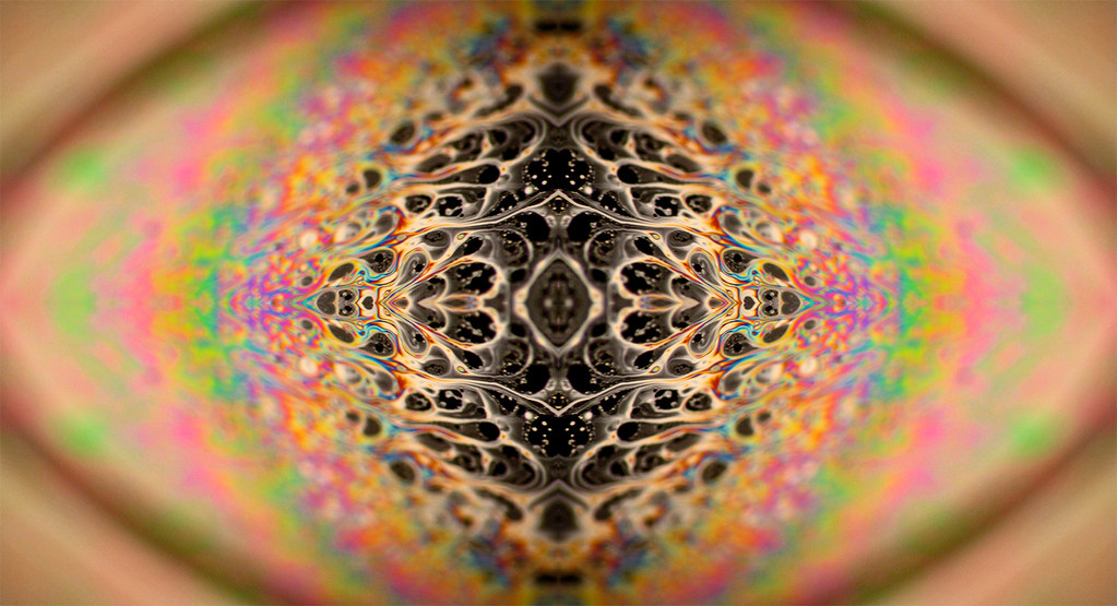
After this I chose to look at other light painting techniques, I looked at a technique where instead of using lights to make lines, I looked at a technique where light is shone onto the object and moved around which creates a very surreal effect in the final photo. A photographer who is well known for this technique is Harold Ross, who is a photographer who was born in America and is well known for specializing in fine art photography.

Harold Ross  


My Attempts 


Even though usually when doing this technique the final photo looks like it’s been painted I wanted the final outcome to be more unusual for example colour which wouldn’t usually be there, shades and shadows which usually would show up in a certain area and just the final outcome to be unusual and make the view take a second look. To do this I used four different colours gels, set the camera on a shutter speed which lasted 25 seconds and moved the lights around creating a lot of different effects.

Matt Molloy


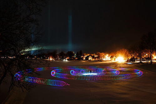
Matt Molloy is a Canadian photographer he is most famous for his time-lapse photography and is known for creating a photographic technique he calls Timestacks, these are the pieces of work which inspired me to try and recreate them. Matt Molloy creates the Timestacks by taking multiple photos were most is still but only one piece is moving and will overlap them causing an effect that almost looks like it’s been painted. While trying to recreate some of his photos I didn’t do it in the same way I did it on Photoshop, although I didn’t want an exact replica of his photo I wanted to do my own style.

Matt Molloy - Inspiration
  
  
My Attempts


When I first started trying to recreate Matt Molloys photos i saw that he used a lot of colour, even though I was inspired by his work I wanted to test what it was like if the effect was done with a dull dark sky. Instead of waiting for a dull day I decided to take a photo of the sky with my camera on the fastest shutter speed so that it would make the final image very dull, because of this it made the foreground into a silhouette which is exactly what I wanted for when I started editing my photos.


When I first put a photo into Photoshop before I decided to do what I was going to do id decided to see what would look like it just blurred out the sky enough to make it look like a painting and make it look surreal, this was good but I felt that that foreground didn't standout as much as I wanted it to, but I didn’t get rid of this idea completely I decided to use this as an unedited photo and build what I was going to do in the first place.


To create this effect i put the original photo in Photoshop, firstly I selected the foreground which the magic wand tool and added all the selected things onto a new layer, once this was done I selected a piece of the original sky and decided to stretch till it filled up the whole of the background, this effect made it look like the camera had captured movement in the sky making it very similar to Matt Molloys photos but at the same time the photos feature a completely different effect.

My Final Photos

1.

Camera Settings:
Aperture - F/8
Shutter Speed - 1/20
ISO - 200


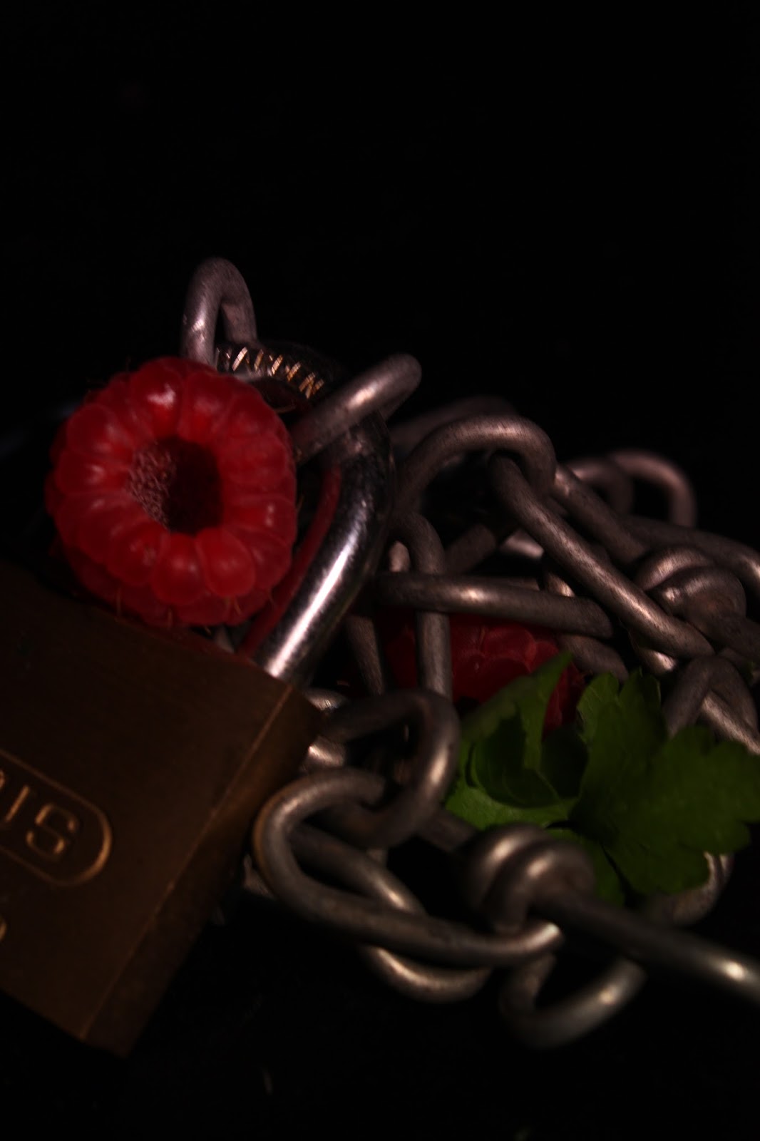
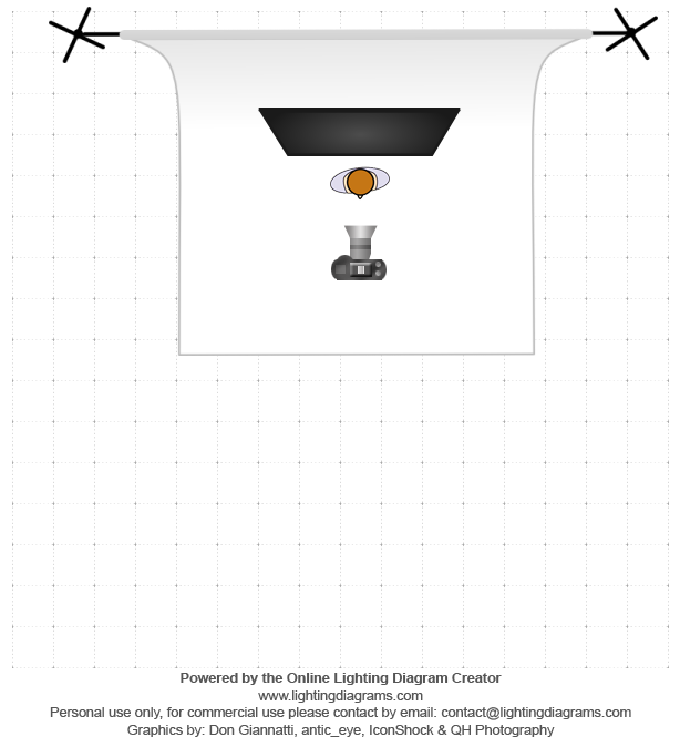
When I took this photo I had the camera on an aperture of F/8 because I didn't want to pick up a lot of light in the photo, if I would have picked up a lot of light I would have got a noisy background and the focus would have been taken off of the chain and berries. I set the shutter speed to 1/20 because I felt it was a fast enough speed to not get any camera shake and it was the right shutter speed for the amount of light I wanted. I light I used was just a normal light with a reflector and an umbrella on it, I used these because I just wanted a soft light shinning onto the main focus and if I wanted a harsher light I would have fitted it with a snoot. I placed one light in this position because I wanted there to be a lot of darkness contrasting the light.

 2.

Camera Settings:
Aperture - F/8
Shutter speed - 1/20
ISO - 200


Like the first photo I used the same settings because I wanted pretty much the same effect, instead I wanted to change the setup of the main focus to create different effects, for example I left a deep hole in the middle where the chain meets the lock I did this because I knew with the settings I was using it would create a very dark shadow effect. Like the one before I placed a light with a reflector on in this position to soften the light and create shadows and expose certain positions.

 3.

Camera Settings:
Aperture - F/8
Shutter speed - 1/15
ISO - 200


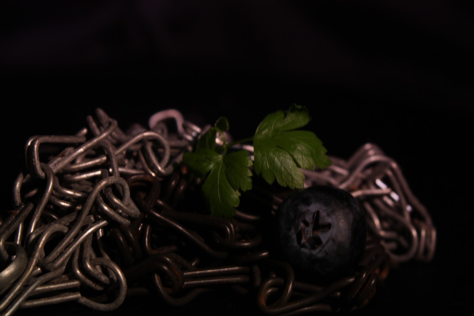
In this photo I position the main focus in the photo (the berries and the leaves) were placed at the side of the photo with the chains taking up the rest of the photo, I positioned them like this because I wanted to do it similar to Ellen O'Connell's photo, she’s has placed the grapes is the bottoms left away from the center with the stalks of the grapes filling up the rest of the space. Like the photos before the aperture is sat at F/8 because I dint want any of the background to be shown, even though Ellen O’Conner shows the background in this photo I didn’t want to because I felt it would take the focus away from the main focus.

 4.

Camera Settings:
Aperture - F/8
Shutter speed - 1/30
ISO - 200


In this photo Ellen O'Connell has a large dark patch right in the middle of the photo, with a bunch of other things surrounding it, I chose to instead of have a piece of darkness in the middle I chose to have a bright main focus in and I surrounded it by chains, I also tilted the light up so that a bright bit was shining on the top of the chain this was to create contrast between light a shade. Ellen O'Connell also in this photo shows the background but again I felt that it would have made the photo to noisy.

 5.

Camera Settings:
Aperture - F/8
Shutter speed - 15sec
ISO - 100


In this photo I set up the camera on a tripod with the main focus directly in front with a blue wall at the back. I have done this because unlike the original photo I wanted there to be more to focus on instead of silhouettes and shapes, I also wanted the light from the trails to shine on the background enhancing the main focus and the colour this is why I placed it so close. I set the camera up on a tripod because it would have caused way too much camera shake if I had to hold it. The cameras aperture was set at F/8 like the photos before but because I was using a long shutter speed I knew there would be a lot of the background visible to the viewer.

 6.

Camera Settings:
Aperture - F/8
Shutter speed - 15sec
ISO - 100


This photo is very similar to the one before but this time I wanted to create more like the original one which Michael Bosanko created, even though it very simple I think it’s very effective, I chose to just use two colours because I felt if I used more than the photo would become way to noisy, like Michael Bosanko I had lines behind the photo and I had pure block colours on the ground, all of the setting were the same as the one before for the same reasons.

 7.

Camera Settings:
Aperture - F/11
Shutter speed - 15sec
ISO - 100


In this photo after I tried the traditional thing with light (the light trails) I looked at other light painting, while looking I stumbled across Harold Ross and tried to create a photo with his influence. like the photos before I set the camera on a tripod and place the main focus in front of it, like last time the shutter speed was on 15sec, but this time instead of creating light trails I painted the object with light from lights off the camera, this time I didn't want much background so I set my aperture to F/11.


8.

Camera Settings:
Aperture - F/11
Shutter speed - 1/3200
ISO - 200


 9.

Camera Settings:
Aperture - F/11
Shutter speed - 1/3200
ISO - 200


 10.


Camera Settings:
Aperture - F/11
Shutter speed - 1/3200

ISO - 200


With all these photos it was just a plain photo of the sky with something in the foreground, the inspiration I used were photos by Matt Molloy but whereas he took multiple photos I didn't I just took one and did my effects on photo shop, first what I did was open up the photo in Photoshop and selected all of the foreground with the magic wand tool, once selected I put all the foreground on a separate layer, after it was put on a separate layer I turned it off so I couldn't see it, now I was working with the original photo I selected a small part of the sky and decided to stretch it out so it covered the whole of the background, this made it look like there was an illusion of movement like the original photos, once it was covering the background I chose to see both layers at once and it made the foreground stand out a lot against the stretched background.


My Project - Culture

My Project

When I first started this project I wanted to focus on the differences between local well off and looked after areas and local deprived/neglected areas. Once I had chosen what I wanted to do I decided to look at other documentary photographers and other streets photographers, I looked at photographers like Henri Cartier-Bresson, Martin Parr and Robert Frank. After I looked at other photographers and saw how they did street photography and documented things I went out and started taking photos myself, while taking photos I tried my first idea but I changed my project to mainly focusing on deprived/neglected areas, I changed my project slightly because I felt if it was focused on one certain topic but had hints of other topics, in this case it was deprived/neglected areas with hints off contrast with new, looked after areas, people would be more interested and focus on the photographs. Now that I knew what photos I wanted to get and what my project was 100% going to be I went around Nottingham and surrounding areas.


My Inspirations
While doing this project I looked at different photographers who specialized in street photography and documentary photography, I looked at people famous photographers like Henri Cartier-Bresson, Martin Parr and Roberto Frank, the most important thing i looked at with these photographers is how they create emotion in the photos and how they tell a story, for example a way I think they do this is the use of light and shadows and the angle the photo is actually taken at. I didn’t just look at photographers which were famous and well known I also looked at photographers who weren't as well known for example a photographer on lens culture called Faisal Al Fouzan who did a project called Kuwait City-Friday Gathering which involved contrasting the similar things I wanted to focus on, he photographed slums and poor areas in Kuwait and in the same photos he would add modern and new buildings, the biggest thing I looked at is how he added other topics to the main photos, how he framed certain things and how he made it so you understood the message he was trying to get a cross.

Portraits - Henri Cartier-Bresson
  
  
Even though my project doesn’t have any portraits in, this inspired me because viewing photos of people exaggerates emotion and showed me how important emotion in photos are, I also like it because usually when documenting something photographers get photos of people, buildings or anything which is to do with what they are documenting but Henri Cartier-Bresson has just used people’s faces from around the world.

Martin Parr
Martin Parr is a British photographer born in Surrey, while looking at his work I was inspired by more than one pieces of his work, two in particular were a book called Benidorm 1999 and a book called A Fair Day.

Benidorm 1999
  
I liked Benidorm 1999 because the photos are documenting what it is like there but because of the style there in they also add humour which interested me even more. I also like the fact that Martin Parr did the whole project not only in colour but made sure that the photos where filled with bright, exciting and eye catching colour which is completely different compared to other documentary photographers.

A Fair Day
  
I like A Fair Day because Martin Parr has documented Ireland in a traditional documentary way but like Benidorm it also has hints of humour for example the photo on the left above, but even though there are hints of humour the majority of the photos are serious and focus on actually documenting.

The Americans - Robert Frank
  
The Americans is a project which Robert Frank is most famous for, it was a project that was published in May of 1958 and is now considered a classic. It explored what American was actually like without the influence of the media. I liked this project and got inspired by it because the main focus was the division between culture, race and wealth in America at that time, which is something I found interesting, I also like the project because of the style of photo, Robert frank uses a low light which I though exaggerated the feeling and message that the photo was trying to get across and even though it exaggerated all of the photos give an honest view of what is happening.

Kuwait City - Friday Gathering by Faisal Al Fouzan
 Image result for kuwait city - Friday gathering  
I liked these photos and found them very inspirational because the main focus is the deprived/poor areas but in some of the photos there are hints of other ways of living for example in the middle photo above the main focus is the deprived/poor things but right in the middle is a mirror which is showing a reflection of a new expensive skyscraper. I like how the photographer hasn't done this is every photo though for example in the first photo he has just focused on the main thing which is deprived things.

If I were to do this project again
If I did this project again instead of using a 55mm lens I would choose to use a 35mm lens, I would do this because after do my research I have found out that a 35mm lens is much better at capturing detail, this would be good because I wanted as much detail in my photos and I wanted the final outcome to have a lot of information and emotion in them. The 33mm are also smaller than the 55mm lens which would have been better if I wanted to get photos of people as it would have been more discreet, which would make the images much more natural.

Contact Sheets


My Final Photos

1.
Camera Settings:
Aperture- F/14
Shutter Speed- 1/15 sec
ISO- 400
The main reason I had these settings is because there was a lot of light bouncing off of the light main focus in the photo and into the camera, I didn't want the wall to be over exposed because I wanted to capture detail and textures, to improve the detail and make them stand out a bit more I have my shutter speed on a low 1/15. I didn't use any filter because I feel I got enough detail and contrast without the use of one.

2.
Camera Settings:
Aperture- F/22
Shutter Speed- 1/25 sec
ISO- 400

The reason I had to have the camera on these settings is because the sky was overcast but was very bright because the sun was shining though because it was bright the camera had to be on a very high aperture to capture the detail in the sky and to make sure that I caught the detail on the tops of the buildings which were being over powered by the brightness of the sky. Because I wanted contrast in the photo I used a blue filter which darkened the lower part of the photo and the dark bits of the buildings on the left.

3.
Camera Settings:
Aperture- F/11
Shutter Speed- 1/200 sec
ISO- 400

Even though there was a lot of light bouncing off the snow I set the camera at F/11 because I wanted a lot of light to be let into the camera, I wanted this because I though if everything that’s bright would work well if it was contrasted with everything that’s dark for example the grass where there’s no snow, the bottom of the house where it meets the floor and the top of the house where it meets the cloudy sky. The shutter speed was set at 1/200 because it bought out just a bit of detail in the darker shades.

4.
Camera Settings:
Aperture- F/11
Shutter Speed- 1/60 sec
ISO- 400
The shutter speed was on 1/60 because I was very close up to the building and there wasn't much light being let into the camera, I still kept the aperture on an average setting because I wanted the white grating to stand out against the brick wall. Because there was very little light as well I only needed a bit of light to make all the details of the wall and pipe stand out.

5.
Camera Settings:
Aperture- F/11
Shutter Speed- 1/125 sec
ISO- 400
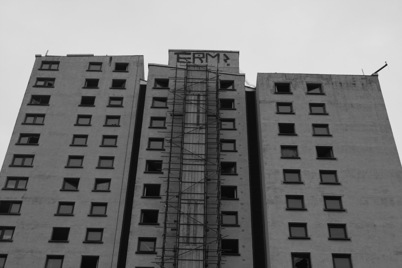
I used an aperture of F/11 because I wanted the white building to blend in with the dull sky almost like its invisible, because it’s on this setting that’s what it does. I had to set the shutter speed at 1/125 because I wanted the building to almost be invisible but at the same time I wanted the detail of the broken windows and the scaffolding to stand out.

6.
Camera Settings:
Aperture- F/11
Shutter Speed- 1/125 sec
ISO- 400
I have the shutter speed on 1/125 because in this photo it was more about capturing details of the rails which were is the foreground the main focus which was the building in the middle and the sky with was in the very background of the photo. I set the aperture on F/11 because I wanted the rails to be dark, the building to be slightly lighter and the sky to be the brightest thing in the photo.

7.
Camera Settings:
Aperture- F/11
Shutter Speed- 1/80 sec
ISO- 400

The camera is on these settings because I wanted there to be a large contrast between the old derelict building and the new building, the shutter speed was 1/80 because it was very dark and over case but I also wanted it to still be dark so I captured some of the details on the building on the left. The aperture was F/11 because I wanted all the white pieces on the new building to immediately stand out, I also wanted contrast on the graffiti in front.

8.
Camera Settings:
Aperture- F/11
Shutter Speed- 1/10 sec
ISO- 400
I have set the camera on these settings because I wanted to capture the details on the wall by letting a lot of light into the camera and making the dark feature on the wall stand out, also on the smashed window I wanted the middle of the window to stand out against the smashed glass which as reflecting the light. If I was to take this photo again I would have done this on a higher aperture to capture a lot more little details on everything in the photo.

9.
Camera Settings:
Aperture- F/10
Shutter Speed- 1/80 sec
ISO- 400

I have set the aperture at F/10 because I wanted to make the church the main focus even though it’s in the background, because it’s the main focus I wanted there to be a lot of detail and information coming from it. I have set the shutter speed at 1/80 because I wanted to make details from the sky stand out but not enough to take the first focus away from the church.

10.
Camera Settings:
Aperture- F/8
Shutter Speed- 1/200 sec
ISO- 400

I have set the aperture to F/8 because it was a long shot there was a lot of information I wanted to get into the photo, i also wanted some lighter feature to stand out more for example the white hand rails in the middle of the photo, I want these to stand out because I want these to lead the viewers eyes to the main focus at the back. I have set the shutter speed to 1/200 because there was a lot of light being reflected into the camera from the wet ground and i wanted to capture the detail and create contrast.

11.
Camera Settings:
Aperture- F/8
Shutter Speed- 1/125 sec
ISO- 400

I have set my camera on an aperture of F/8 because I wanted the top of the building to blend in with the sky but still contain detail for the viewer to notice, I set the shutter speed at 1/125 because like some of the other photos I wanted the dark graffiti to stand out and wanted it to be able to be readable by the viewer to make them feel a connection with the photo.

12.
Camera Settings:
Aperture- F/8
Shutter Speed- 1/200 sec
ISO- 400
Like photo 10 I have had to set the aperture on a low setting because there was a lot of information I wanted to capture, I also didn't want a lot of detail in the brighter things I wanted them to be duller and plain which is why I decided to slightly over expose it. I set the shutter speed at 1/200 because I still wanted to capture a lot of the detail form the wet floor and the little damages which have been made to the space. I also did this photo in this style because it’s the other side of the white railings which is featured in photo 10.


Monday, 25 January 2016

Visual Communication - Monuments Should Not Be Trusted

Nottingham Contemporary
Monuments Should Not Be Trusted

The Exhibition Monuments Should Not Be Trusted is an exhibition at the Nottingham Contemporary involving 30 leading artists and groups from the "golden years" of Socialist Federal Republic of Yugoslavia, which were the early 1960's to the mid 1980's. over 100 pieces of artwork and artifacts were shown during this exhibition and was the first time artwork of this time to highlight the social, economic and political conditions of this period was shown in the UK. the exhibition starts by showing the significant rise of consumerism during Josip Broz Tito's 37 year presidency, and ends just years after his death in 1980. during this exhibition there weren't just artists work on show such as moving images, photographs and paintings, ect. there were also things from presidents Tito's life such as birthday gifts and things like music and TV clips.

 Bogdanka Poznanović, Akcija srce – predmet, 1970. (Detail) Marinko Sudac Collection

During this exhibition there were a lot of different ways that the artists showed there work, for example there was a photo of the rolling stones printed out on 36 match boxes, even though this is a small thing it makes the piece of art stand out from the rest of the work. 

 OHO/Marko Pogačnik, Rolling Stones Matchboxes, 1968. Marinko Sudac Collection

there was another couple of pieces which stood out were photos of a room with certain things happening in there and a specific piece of artwork in the photo which was made to stand out, separated and placed above the photo was the actual piece of art which was in the photo. this made me investigate and take a double look at the photo and the piece of art.


Monday, 18 January 2016

Final Studio Practice Portfolio

Alex Saxton's Studio Work

During my project I will be looking at 3 photographers work to gain inspiration and ideas, once I have gained inspiration I will go on to take 10 of my own photos and produce 10 final printed images. The three photographers I have chosen are Ellen O'Connell, Michael Bosanko and Vivian Maier. The reason I have chosen Ellen O'Connell is because there are 2 photos by her which are close up shots and show the textures of the main image in the photo, I am inspired by this because I want to do something with different patterns and textures. The reason I have chosen Michael Bosanko is because he does a lot of thing with like and slow shutter speeds I was inspired by this because I like the aesthetics and I would like to test out how final images will appear when a slow shutter speed is involved. The final photographer I have chosen is Vivian Maier this is because even though a lot of her photos are taken outside a studio there is a lot of use of colours which I was inspired by and even though the final photos which are inspired by her aren't going to involve all the same things or techniques I am going to use a lot of colour in them.

The main objective during this project is to produce 10 high quality photos which involve inspiration and ideas from the three photographers I have chosen. But while I do this project I want to learn new techniques and ways of taking a photo which will broaden my knowledge when it comes to taking photos in the future. I also want to try things out and experiment with things that I wouldn't normal do for example the idea of taking photos which focus on textures and testing the slow shutter speeds, because I’m experimenting with different things like learning techniques it will broaden my knowledge of photography

Work Plan

Week 1 - 11/01/16
During the first week I want to find 3 photographer and investigate there photos and find things which inspire me to create my own images.

Week 2 - 18/01/16
Finish my research into which photographers and which photos I’m inspired by. Start taking photos and creating my own images.

Week 3 - 25/01/16
I will use the third week to continue taking photos and creating images during the time we already have in the studio and time I will book out in the studio.

Week 4 - 01/02/16
Week four I will review the images I have taken, if they need touching up or retaking I will do this then, if all are up to standard I will print them off. 

11/02/16-I will hand work in.